Tuesday 7 October 2014

Monocromatic


I think the art i make i want to stick to a Monocromatic style. I feel graphicly its nicer to the eye and much more appealing and finished looking.


The cards are so beautiful and printed to a high polished standard. I like the use of symbolism to represent the land cards.


I love the style, the colours, tone and lighting that the magic the gathering land cards have.
There so detailed and beautiful, Would love to look into trying this style.
So i got sent this from a friend, saying she saw my tree on her twitter page:


Im so shocked people i don't even know are talking about and taking part in the tree of life.

This year - Still unsure but getting there

I think im panicking alot about what i need to do and have as an outcome.
Where i should be thinking about what i want to do which is have a unity in my art style where people can see something is my art even with different media types and forms.

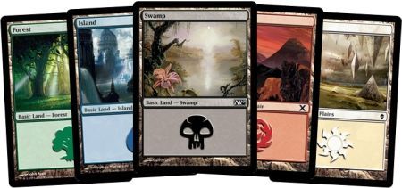
Overall i would like to have my own franchise for a game with logo/poster designs, environments, card game designs and what else i have time for. This way i can show my style in different forms.

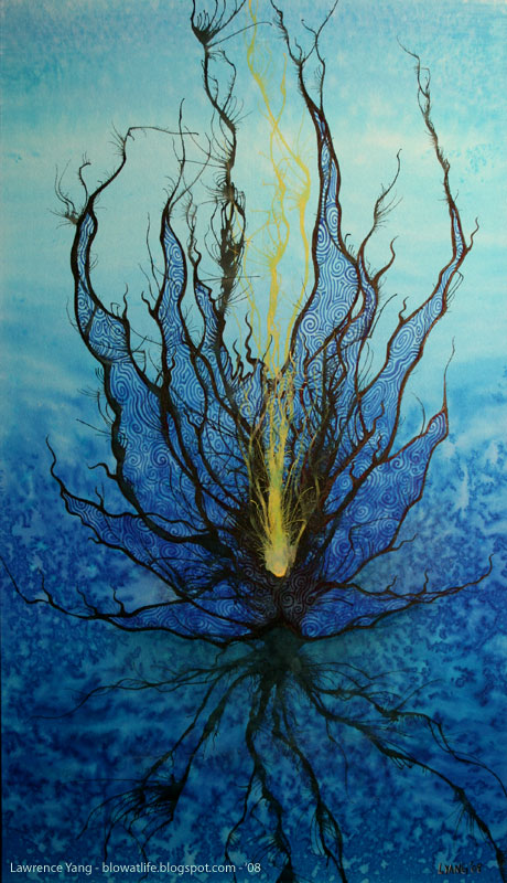
I still feel an important part to look at is line work, ink/watercolour markings, lighting, shadow and tone is a major factor in art.

Child of light

Im really glad i stumbled upon this game as its exactly the style of game/environments iv always wanted to create.

Child of light


Here is a link to the webpage for child of light.


Another image of the art for child of light, Love the use of colours, style everything.


Would like to create something as detailed as this but so well painted and considered when mark making.


Another well known game with the watercolour sketch style, think there could be alot done in this style/media.


I loveeee the detail done in this watercolour, Must have took so long to do.

Next stage


Child of light


Love this, would like to create some game art like this
Not really seen before and feel it could be looked into 


Again a successful use of ink art in graphics.


Love the positive negative space, The use of sketch lines and spray marks.


Some really nice use of ink designs in graphics, love the style and depth given by the use of 3 colours, pink for attraction, with tones and highlights adding detail and depth.


Looking at the use of ink art and graphic design, Looks very sheek and sophisticated

This is beautiful  i love the energy the lines and marks give off, i love the use of colour.
Very well done.


Also something different about this, the line work, the detail, the use of shadow and lighting, the fact its monochrome attracts me to it aswell.


Something about this i really enjoy, cant pin point if its the colours, the linework or not but i like it.


Nice simple line work with considered markings, nice to see it well done.


I love this, so well placed, line work done beautifully, highlights, shadow and tone done well and negative space considered.
Only thing i dont like is the blue marking behind the face.

Inspiration


Love the water and bleed marks, so well placed and drawn on top